To see previous Asian Insights articles, click on the title of interest below:
July 2023 (001) Red Lacquer Box, China, 1951.12a-b
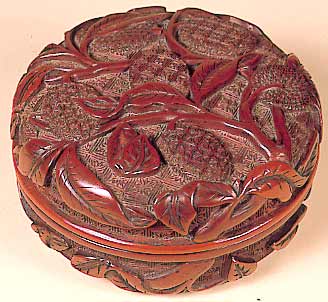
Red Lacquer Box
First printed for members in the AAC Newsletter, August 2020
15th c. China
Acc. No. 1951.12.a.b
This small (2 7/8 in. x 2 7/8 in. x 1 ½ in.) round cushion form is carved red-over-black lacquer on wood. It is decorated with a deeply carved motif of lychee fruit, leaves, and branches on a delicately carved background diaper of geometricized flowers. The rich vegetal and floral design carved in red lacquer is typical of the Ming period (1368-1644). Lacquer is derived from the resin (sap) of a tree native to southern China, which may be colored by addition of pigments such as carbon soot (black) or the mercury sulfide known as cinnabar (red) that gives rise to the common name for red lacquer-ware. The lacquer is applied in many coats, from 30 to as many as 200 layers, which are allowed to dry between applications to a hard, opaque and glossy finish before carving. Lychee are a sweet summer fruit with an auspicious red skin. In China, the lychee is often a symbol of romance and love because of its red color, which is the color for brides; indeed, a pair of lychee symbolizes fertility. However, the stem character “li” in the Chinese name for lychee, “li zhi”, can have meanings related to characteristics of strength, profit, or benefits, extending the symbolism of lychee to include these traits. Thus images of lychee are often found in Chinese corporate offices, as an omen of profitability. The small box shown here would have been a luxury item for the Ming elite, expensive due to its lengthy and skilled requirements to fashion, and may have been used for storage of incense or cosmetics.
Aug 2023 (002) Harvest Moon-viewing, Japan, 2002.16
Harvest Moon-viewing
First printed for members in the AAC Newsletter, September 2020
early 20th c. Japan,
Acc. No. 2002.16
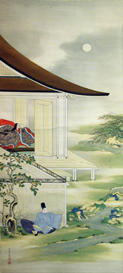
This ink and color on silk hanging scroll (55½ x 22½ in) is an example of the nihonga (“Japanese painting”) style of painting that arose in the Meiji era (1868-1912) and developed further in the early 20th century. The opening of Japan to Western influences, including rapid modernization and adoption of Western art techniques and styles, led to the nihonga counter-movement to moderate the ascendance of external aesthetics in favor of a more judicious incorporation of some Western stylistic elements, e.g. spatial perspective, while maintaining traditional Japanese themes, brush techniques, and materials. This scroll exemplifies the nihonga style as a work combining traditional ink outlines with color washes in muted palette, absence of shadows, and a Japanese historical subject matter based on the Tale of Genji, yet the work also incorporates some architectural realism and perspective lines to render a fresh, modern appeal. The artist’s signature in black ink and red seal is in the lower left of the scroll, but is not legible at the resolution of this image of the work.
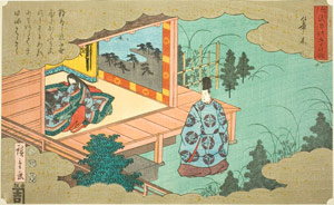
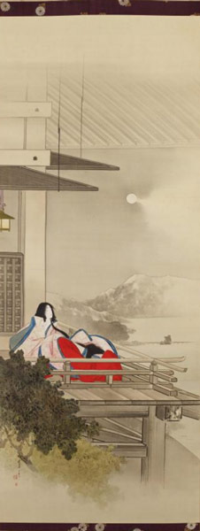
Lady Murasaki is the author of the 11th century serial novel Tale of Genji, which it is believed she began to write while viewing the moon from the Ishiyama Temple on Lake Biwa. Thus representation of Lady Murasaki in the Moon-viewing Pavilion at Ishiyama is a traditional motif in Japanese painting and woodblock prints. It seems the artist of the Museum’s scroll
has deftly combined the motifs and compositional organization of both these prior works to create an original design based on the Tale of Genji theme. The custom of moon-viewing in autumn, originating among the nobility such as Lady Murasaki during the Heian period (794-1185), continues today as a popular activity of the fall harvest moon or mid-autumn festival celebrated across Japan.
Minneapolis Institute of Art
Sep 2023 (003)
Paintings on Bodhi Leaves, China, 1975.49.1-10
Paintings on Bodhi Leaves
First printed for members in the AAC Newsletter, October 2020
Folio from Album of Ten Paintings, 18th c. China, Acc. No. 1975.49.1-10
Shown here is one of a set of ten paintings mounted within brocade covers. Each painting is ink and color on a bodhi leaf attached to a blue paper sheet measuring 11 x 7 in. (28 x 18 cm) and depicts one or more luohans, or followers of Buddha who have achieved enlightenment. Painting images of luohans on bodhi leaves was fashionable during the Qing dynasty, particularly after the emperor Qianlong (r. 1735 to 1796) wrote a eulogy for each luohan in the latter half of the 18th c., when this album was probably created.
The bodhi tree is important in the Buddhist religion because Siddhartha Gautama, the historical personage of Buddha, attained enlightenment while meditating beneath a bodhi tree in northern India circa 500 BCE. Painting on bodhi leaves thus became a form of Chinese Buddhist art. A bodhi leaf is first soaked in water for up to a month to decompose and eliminate the green leaf tissues, leaving only the veins. The remaining leaf vasculature is then pasted onto a cut piece of brown paper conforming to the leaf shape. After painting, the leaf is mounted on a colored paper frame. Such paintings were sold to Buddhist pilgrims as souvenirs. The fragile organic nature of such works means that few examples survive, so extant pieces are principally from the Ming and Qing dynasties (1368-1912).
Oct 2023 (004) Kano School of Painting, Japan, 1978.60
Kano School of Painting
First printed for members in the AAC Newsletter, November 2020
late 17th - early 18th c. Japan,
Acc. No. 1978.60
The subject matter of this hanging scroll (69 9/32 in. x 20 7/8 in.) is delicately rendered in ink on silk. The artist’s signature in black ink and seal in red ink at the lower left of the scroll (enlarged above) identifies him as Kano Chikanobu (1660-1728), the third-generation head of the Kobikicho branch of the extensive Kano school of painting, the preeminent artistic influence for Japanese painting over four centuries from 1600-1900.
The Kano school rose to prominence after its progenitor Kano Masanobu (1434-1530) was appointed the first secular (non-Buddhist clergy) official painter to the shogun in the 1480s. Originally following a patrilineal succession, demand for the esteemed works of the Kano artists blossomed during the Tokugawa shogunate Edo period (1600-1868), leading to expansion of the school into an academy of four branches led by extended family members. In 1678, Kano Chikanobu began working with his father at Edo Castle in service of the shogunate and in 1713 succeeded his father as head of the Kobikicho branch of the Kano school. Stylistically, the Kano school is best known for its larger scale paintings on sliding doors and screens covered by dramatic designs boldly colored on gold leaf background and for its smaller pieces, typically hanging scrolls, characterized by delicate Chinese-influenced washed ink or splashed ink (hatsuboku) depictions of nature scenes.
signature in black ink
and seal in red ink
Nov 2023 (005)
The Eight Wise Men, China, 17th-18th c.
The Eight Wise Men of the East Quarter of Heaven, 17th-18th c. China
First printed for members in the AAC Newsletter, January 2021
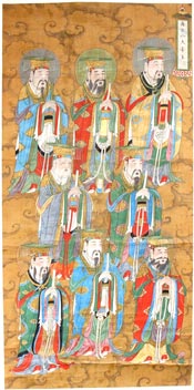
17th-18th c. China,
Acc. No. 1934.23
Eight elaborately garbed male figures float mysteriously in formation across this hanging silk scroll painting (56 3/4 in x 27 in), with mouths open as if singing or chanting. They are shown in three-quarter frontal view all facing to the right, in three registers with little overlap of the figures, perhaps signifying their equal importance. Each figure is dressed in the vestments of a Dao priest. Attire and accessories for Dao clergy reflected the Ming (1368-1644) imperial court styles and were governed by Ming laws established in 1382. The bright colored robes are in the square style of jiangyi or Robe of Descent, and are rendered in mineral pigments; such strong coloration is a characteristic of Ming court painting. The different colors of the robes may denote relative rank of the priests or reflect the colors associated with specific roles or symbolic identities. The lozenge-shaped medallions on the robes appear similar for all the figures and may have cosmological significance. The robes provide the priests with symbolic connection with the cosmos and mystical ability to bridge the earthly and heavenly realms.
Each priest wears a hat in the ancient style of mianguan, a mortarboard with hanging tassels front and back strung with jade beads. A mianguan with 12 tassels could only be worn by the emperor, while 9 tassels denotes royalty, and 7 or 5 tassels indicates a high or middle rank court official. The mianguan of the priests in this scroll appear to have 9 tassels, signifying their high-level royal status. In Dao practice, the mianguan is only worn for the most important rituals, e.g. those involving sacrifices to Heaven. Each priest is holding the ritual carved ivory tablets used in Daoist ceremonies; these are modeled after the tablets of rank displayed by court officials during imperial ceremonies, but would bear Daoist images and symbols. Behind each of their heads is a nimbus signifying that these are not human beings, but among the pantheon of Daoist celestial beings. The uniform background of tan ruyi clouds further indicates that this assemblage is in the heavenly realm. Thus these figures represent high-ranking Daoist divinities. There are multitudes of Daoist deities, organized in a hierarchical structure similar to the official government bureaucracy. A portion of the complexity of rank and numbers of Daoist celestial beings is illustrated in the 27-foot-long scroll The Ordination Scroll of Empress Zhang, Acc. No. 1961.94, one of the most important extant works documenting the relationship between Taoism and the Ming imperial family.
Perhaps surprisingly, this hanging scroll featuring Daoist celestial beings is an example of a genre known as Water and Land paintings that would have been used in a Buddhist ritual. Chinese spiritual beliefs and traditions are rooted in a syncretic combination of Confucianism, Daoism, and Buddhism, with strong mutual influences especially between Daoist and Buddhist thought and practices. The Buddhist Liberation Rite of Water and Land (shuilu zhai), also called the Water and Land Deliverance Ritual, probably came into practice in the tenth century but may possibly trace to Emperor Wu of the Liang dynasty (464–549). The rite includes features of both Buddhism and Daoism in which celestial beings in higher realms of existence are petitioned to relieve beings (both living and dead) in the lower realms from their suffering and to ensure their salvation from hell. Fasting (zhai) rituals were most commonly commissioned on behalf of an ill person, to petition for their recovery, or for a recently deceased person, to solicit their admittance to heaven. Hanging scrolls such as this one would be hung in one of several ritual altar rooms as a focal point for the ceremony.
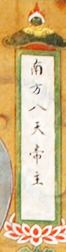
The eight figures in this scroll are collectively identified by the inscription in the cartouche in the upper right-hand corner of the scroll. The characters appear to be: 南方八天帝主, which may be translated as 南方 = south, 八天 = eight (八) celestial beings, tian (天), 帝主 = emperor, or alternatively the latter characters may be read as eight (八) God Lords 天帝主. Thus the cartouche could be translated as either The Eight Celestial Beings of the Southern Emperor (or flexibly, the Southern Realm) or The Eight Southern Emperor Deities. The character for east, 東, does not appear present in the cartouche, calling into question the assigned listing of the work as relating to the East. Interestingly, the Daoist Celestial Emperor of the Southern Pole (star) or Realm, Nanji tian dijun, also called The Old Immortal of the South Pole, Nanji xianweng, is known as the God of Longevity and therefore is the god that determines the length of human life. This suggests a speculative interpretation of this scroll could be that it shows the retinue of highest (royal) level of celestial attendants to the southern god of longevity, to whom supplications were made during a Rite of Land and Water asking for their intercession with the god of longevity to cure and prolong the life of an ill person.
Feb 2024 (006)
Landscapes of Liu Guosong, Taiwan, 20th c.
Click and scroll down
Landscapes of Liu Guosong, 20th c., Taiwan
First printed for members in the AAC Newsletter, February 2021
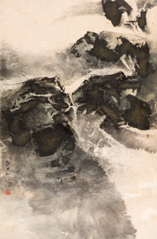
Acc. No. 2013.29
A precedent example of modern Chinese ink painting, this work on fibrous paper with silk border (33½ in. x 22 in.) is typical of the semi-abstract landscapes from the early 1960s that launched the career of Liu Guosong, acclaimed as the “father of modern Chinese ink painting”. This work blends traditional Chinese literati ink painting elements of landscape subject matter, monochrome tonality, and inclusion of empty space with the abstract and expressionist characteristics advanced by Western artists in the 1950s. Other works of Liu from the 1960s include bold brushstrokes inspired by Tang era cursive calligraphy known as kuang cao (狂草, lit. “mad draft”) to delineate landscape features, as shown in this work, also from the SDMA collection:
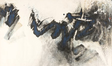
Acc. No. 1970.50
Liu (b. 1932) emigrated as a youth from China to Taiwan in 1949, and there studied Chinese ink painting and calligraphy. However, he endeavored to evolve the discipline of ink painting, whose tenets and techniques were established in the Tang era, with modern artistic innovations to infuse new vitality and a modern historical context to the otherwise venerable genre.
Encouraged by exposure to Western art developments and Taiwanese direction to distance its new nationalistic culture from mainland influence, Liu experimented with different papers for his paintings and discovered that a paper for lanterns containing embedded fibers allowed him to create new textured surface effects and subtractive white lines by removing selected fibers after ink application. He was soon custom-ordering his preferred blend of long-fibered paper, subsequently named “Liu Guosong paper”, from a cotton mill in Taipei.
Liu expanded the traditional landscape subject matter of ink paintings to include non-terrestrial motifs in his so-called “Space series” that he began after the 1969 Apollo 11 space mission. These space-scapes include bold-colored moons amidst compositions influenced by the graphic art and pop art techniques of airbrushing, collage, and flat space and geometric shapes prominent in Western art of the 1970s. His later innovations in ink painting include developing the shui tuo, or "water rubbing" technique, in which ink is floated on the surface of water and absorbed into a sheet of paper placed on top, and the zi mo, or "steeped ink" technique (a variation of monoprint), in which two adjacent sheets of paper are wetted and then ink is splashed or poured on them to diffuse in. Liu used the incidental ink patterns formed by these processes as the basis for his artistic vision for the work-in-progress.
By technical experimentation and innovation, and infusing his work with modernist visual styles, Liu Guosong has invigorated Chinese ink painting to reflect the contemporary context of Chinese culture.
Mar 2024 (007)
Buddha: Papier Mâché, Myanmar, 19th c.
Buddha: Lacquered and gilt Papier Mâché, 19th c., Myanmar
First printed for members in the AAC Newsletter – March 2021, p 5
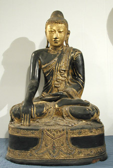
19th c. Myanmar, Acc. No. 1938.146
Although the object featured this month is a sensitively rendered Buddha which has never been on display, it is brought to life in this analysis.
This sculpted image of the Buddha is made from lacquered and gilt papier mâché (27 1/2 in x 18 in x 12 in). Dressed in a monk’s robe with its sash of three-dimensional folds cascading over his left shoulder, he sits in the full lotus position or padmasana. His gracefully sculpted left hand rests palm up in his lap in the dhyana mudra, or meditation gesture, while his right hand, in the stylized iconography of the bhumisparasa mudra, touches the ground to reflect how he called upon mother earth to bear witness at his moment of enlightenment under the bodhi tree. The face is sensitively modeled to express benevolence, repose, and a slight smile of contentment. Long ears touching the shoulders carry dual meaning: they relate to the heavy earrings once worn by the Prince before he renounced materialism to seek spiritual enlightenment, and to his all-hearing compassion as the Buddha. The cranial protuberance, or ushnisha, signifies his wisdom.
Close examination of the figure (viz. expanded view on the SDMA website) reveals small mirrored roundels along the edges of his garment and on the uppermost and lowest of the three tiers of the pedestal, including rosettes of red and green mirrored roundels. The decorative element of embedded mosaic mirror detail is characteristic of the Mandalay style of Burmese Buddha sculptures. The headband extending across the hairline from ear to ear is another identifying characteristic of the Mandalay style Buddha, and in this sculpture may also include the decorative mirror tesserae. The headband, along with the broad shoulders and narrow waist of the figure, reflect the stylistic influence of Thai artisans beckoned to Burma in the mid 1700’s for their carving skills.
This image of the Buddha was likely made using the dry lacquer technique, which became prevalent in Burma in the 18th c. but which fell into disuse after the 1920s. With this method, the rudimentary form is first created in clay and then covered with a plaster of straw ash in water. Next, several layers of lacquer-soaked cloth are applied and each allowed to dry before the next application. The lacquer is the sap from the thitsee tree, Melanorrhoea usitata, endemic to Burma. A layer of lacquer putty called thayo, made from lacquer, sawdust, and straw ash, is applied to refine the figure by sculpting with an iron tool called a thanlet. Strips or other shapes of thayo may be applied to create relief features. Once dry, the inner clay core is removed either by washing or by splitting the piece and removing the clay, then reassembling and sealing with lacquer. Additional topcoats of lacquer may be applied before the piece is rewashed and polished; the best lacquer is naturally black and shiny. Final embellishments, such as the thayo lacquer scrollwork and embedded glass mosaics seen on the robe and base of this work, may be added and lastly gilding is applied. Gold represents the sun or fire in Buddhist symbolism, and thus when applied to a sculpture or architectural feature signifies the radiance of spiritual energy and power of the Buddha.
Buddhism was rooted in Burma by around the 5th c. Mandalay became the last royal capital of Burma when King Mindon (r. 1852-1877) established his court there during the British occupation and eventual annexation of the entire country. With King Mindon’s direction and support, Mandalay became the center of Buddhist scholarship and art, and remains today as the cultural and religious heart of Burma.
Apr 2024 (008)
Korean Scene, Japan, 1950-1960
Korean Scene, 1950-1960, Woodblock Print, Japan
First printed for members in the AAC Newsletter – April 2021, p 5
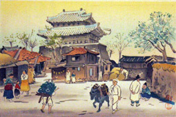
This color woodblock print is an oban yoko-e; the most common size of Japanese paper for woodblock prints is oban, 9 3/8 in x 14 1/4 in, and yoko-e is a print in landscape format. In the lower right of this print, the artist’s seal, a stylized Japanese kanji for the verb


The artist Hiyoshi was born in Tokyo in 1885, and graduated from the Tokyo School of Fine Arts in 1909, where he studied with Okada Saburosuke (1869-1939), a Western-style painter who had studied in France (another of Okada's students was the print designer Kawase Hasui, 1883-1957). Upon graduating, Hiyoshi accepted a teaching post in Korea, one of many Japanese artists who taught in Korea, and he stayed until 1945, when the colonial occupation of Korea by Japan (1910-1945) came to its end.
After returning from Korea, Hiyoshi designed woodblock prints for the publisher Kyoto Hanga-in in the early 1950s, focusing on scenes from Korea. The official print title for this work is shown as Korean Scene, on page 15 in the publisher’s catalog dated from somewhere between 1952 and February 1953, and is shown as Korean Scene (Gate of Castle) A, on page 20 in the next catalog published between August 1953 and January 1954. It is one in a series of at least six prints that Hiyoshi created showing scenes of daily life in Korea, based on his remembered experience from living there. Therefore, though this print depicts a scene from Korea, it was created in Japan.
May 2024 (009)
Green Tara, Tibet, 18th c.
Green Tara, 18th c., Thangka, Tibet
First printed for members in the AAC Newsletter – May 2021
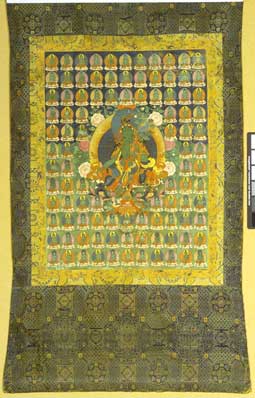
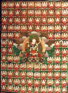
Acc. No. 2000.6
An art form that originated in Tibet as early as the 7th c., the thangka is a portable sacred object with a painted devotional image mounted within a textile border and frame, usually silk brocade. This thangka is a typical size for the genre (25 ¾ in x 19 ¼ in) and shape, with flared lower brocade section, and was painted on a cotton fabric, also standard. Wooden rods are stitched into the upper and lower hems to facilitate hanging. To protect the painting when not being viewed, there is usually a square cloth veil to cover it, which is secured at the top with cords or ribbons when viewing the painting, however these are not visible in the photo image of this work. Though the medium for this painting is described as gouache and gilt, thangka pigments, which may be mineral or organic, are mixed with water and also typically a binder of gelatin size, i.e. animal hide glue, and therefore are more properly termed distemper paints. They dry quickly to an opaque and matte finish. However, as thangkas are intended to be rolled up for transport and storage, the paint and textiles are susceptible to damage from such handling, as well as to deterioration from light exposure.
The subject of this thangka, Green Tara, depicts the Tibetan female principle of the bodhisattva of compassion Avalokiteśvara, also known in Chinese Buddhism as Guanyin. Within Tibetan Buddhism, Tara has 21 major manifestations, each associated with a specific color and specialized abilities and powers. Popular beyond Tibet in other Himalayan countries and also Mongolia, the most venerated manifestations are Green Tara and White Tara.
Tara means “star” in Sanskrit, reflecting the belief invested in her that she is able to guide followers, like a star, on their spiritual path. 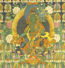
The typical pose for Green Tara as seen in this thangka (Acc. No. 2000.6) is the lalit asana, or “pose of royal ease”, in which the left leg is in the lotus position but the right leg hangs down over the edge of the lotus seat. Furthermore, her right foot is usually resting on a small lotus footstool as seen here. This symbolizes her readiness to jump into action to assist her followers, as she is believed to take an active role in the daily affairs of believers, particularly by alleviating fears brought to her attention. Notice that the background behind the replicate figures of this thangka is black on the upper half, whereas the lower half background is green, alluding to the night sky and earth, respectively, with the central Green Tara figure straddling both domains. Her right hand is shown in the varada mudra, or gesture of benevolence. Green Tara most often holds in her left hand a blue lotus as seen here, also called the night lotus (utpala), as another reference to her association with the moon and night-time.
Acc. No. 1967.25
Thangkas depicting a deity are consecrated for use, to serve as the abode of the deity for worship and supplication by the devotee. Meditation upon the iconographic imagery of a thangka, including those with designs of a mandala (geometric diagram representing the cosmos) in place of one or more deities, would accrue merit for the adherent and aid their spiritual progress. Thus thangkas are hung in monasteries or the shrine area of a personal space. The design of this thangka, with a central main deity amidst a background of many smaller similar replicates, is an established compositional type. Arranged in neat rows and columns, there could be up to two hundred smaller replicates of the main image; one hundred miniatures are visible in this work. A composition of this type would be commissioned to enhance the merit obtainable by the patron or to increase the force of the deity’s response to petitions, as it is believed there is strength in numbers, and multiplying the number of images also multiplies the potency of the thangka as a spiritual vehicle.
July 2024 (010)
Dream of The Red Chamber, China, 1923
Dream of The Red Chamber, 1923, Ivory painting, China
First printed for members in the AAC Newsletter – June 2021
Acc. No. 1994.204
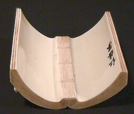
Carved from ivory in the form of an open book, this double wrist rest is quite small at 4 1/8 in x 3 7/8 in x 1 3/4 in. On the convex face, the left side is incised with text whereas the right side is inscribed with a scene of four women seated at a table in an outdoor pavilion framed on two sides by a gnarled tree and its branches. There is a signature on the concave face, and incisions to resemble the binding of a book. The incisions on both sides are stained with ink, principally in black, though a few Chinese characters flanking the narrative scene are in red and the “edges” and “binding” of the “book” are stained a golden tan.
Beginning with the tradition of the scholar’s desk during the Ming dynasty, writing accessories such as brush handles, brush rests, brush pots, wrist rests, seals, and table screens were sometimes carved in ivory. Wrist rests were used in the creation of calligraphy and brush paintings to prevent smudging of freshly laid ink. Chinese is traditionally written from right to left and top to bottom, so an arm rest or wrist rest would be placed over the fresh ink to prevent a wrist or sleeve from spoiling it. Thus arm rests and wrist rests were typically rectangular with concave (interior) and convex (exterior) surfaces, commonly obtained from a split bamboo cane or elephant tusk. Most ivory wrist rests are longer than this work, and have elaborate figural interior carvings in high relief with undercutting. The convex, i.e. publicly displayed side, is typically rather plain with low relief carving or only incisions often of poetry, consistent with the literati scholar’s outwardly restrained and refined aesthetic that reserved extravagant displays for private viewing.
The subject matter of this wrist rest is the 18th c. Qing dynasty novel, The Dream of the Red Chamber by Cao Xuegin, considered one of the four great classical novels of China. The first edition was published in 1791 and it has since been translated into over 100 languages; the standard Penguin English translation is 2500 pages. There are 30-40 major characters and over 400 minor individuals; the number of women characters and the depth of their portrayal is noteworthy. The story may be semi-autobiographical, following the rise and fall of the author’s family of nobility, and emblematically, of the Qing dynasty. Much of the novel takes place in the Prospect, or Grand View, Garden, presumably the location for the vignette on this wrist rest.
Aug 2024 (011)
Manjushri, Mongolia, 18th c.
Manjushri - Personification of Wisdom
18th c., bronze sculpture, Mongolia
First printed for members in the AAC Newsletter – July 2021

Acc. No. 2006.375
The personification of wisdom in Buddhist tradition, Manjushri here is manifested in a finely detailed gilt bronze sculpture (9 1/4 in. x 6 5/8 in. x 4 5/8 in.), sitting in dhyanasana (position of meditation) on a double lotus base with beaded upper and lower rims and draped with pendant sashes. Incised vine and foliate designs at the lowest level of the base appear also on the knees and hem of the dhoti worn by the figure. The robust torso is accentuated by a remarkably narrow waist reflecting the influence of Indian Pala and Nepalese Newari stylistic precursors. The broad round face features the distinctive Nepalese-style Buddha “wisdom” eyes with the dip in the middle of the eyelid. Eyes half open and half closed represent a state of meditation with concurrent mindfulness of the world. Prominent curves of the plump and peaked bow mouth mirror the curves of the eyes. Strengthening the visage is the long straight nose.
Atop the head is the five-pointed crown representing the five cosmic Wisdom Buddhas of Buddhist doctrine. Flat ribbons descend from it on the sides and turn outward and upward framing the ears in a motif common to Mongolian Buddhist sculpture, and which may be inspired by a similar antecedent Tibetan flourish. A celestial scarf drapes over the right upper arm and wraps around the left elbow beneath the lotus vine. The hair is coiled in a double topknot with some cascading loosely over the right shoulder; at the apex of the coiffure there is a flaming jewel symbolizing the power of Buddhist teachings or, alternatively, the wish-granting capability of Buddhist practice and devotion.
In addition to the five-pointed crown, the figure is adorned with the other twelve of the thirteen princely ornaments of a bodhisattva (a celestial being who is destined for enlightenment), which are: heavy earrings, several necklaces, armbands, bracelets, strands of pearls, belt, and anklets. Many of these are inlaid with semi-precious stones, an embellishment that became prevalent in the mid- to late 18th c. Emblematic for the identification of the figure as Manjushri, the right arm is raised to wield the sword of wisdom to cut away ignorance and all impediments to enlightenment, though the sword is missing. The left hand displays the vitarka mudra, or gesture of intellectual discussion and debate, and holds the stem of the lotus that rises against the left arm. The lotus held by Manjushri typically has a book or palm leaf manuscript on top of the flower, representing the Prajñāpāramita sutra, or scripture of “The Perfection of [transcendent] Wisdom”, which elaborates the concept of bodhisattvas and provides the first mention of Manjushri. The tome is not readily visible in this sculpture and may also be lost.
Key characteristics that classify this work as a sculpture of the Zanabazar school of Mongolian sculpture are: rich gilding, finely modeled smooth contours, incised patterns of fabrics, precise often beaded embellishments, round face, high forehead, thin and arching eyebrows, high-bridged nose, and small, fleshy lips. The pedestal with ornate and finely detailed lotuses and pearl beading are also identifiers.
Zanabazar (1635-1723) was born with the given name Eshidorji into a leading Mongol family directly descended from Genghis and Kublai Khan. At four years old he was declared the spiritual leader of the Khalkha ruling class. During a trip to Tibet in 1649 when he was fourteen years old, he was ordained as a Yellow Hat Buddhist lama and identified as the reincarnation of a revered Buddhist scholar (who was himself a reincarnation of one of the original 500 disciples of the Buddha) by the Fifth Dalai Lama who also gave him the Sanskrit name Jñānavajra (Zanabazar in Mongolian) meaning "thunderbolt scepter of wisdom". Consequently, he was recognized by the Fifth Dalai Lama as the first spiritual head of Yellow Hat Tibetan Buddhism in Mongolia and the top ranked lama in Mongolia, a theocratic ruling title. By this elevated status, Zanabazar came to play a significant role in establishing Yellow Hat Buddhism in Mongolia as the dominant religion and in influencing social and political events between Mongolia and the Kangxi Emperor (1654-1722) of the Qing dynasty in China.
A Mongolian “renaissance man”, in addition to his roles as monk and statesman, he is also esteemed as a scholar, linguist, astrologer, physician, poet, and architect, but especially as a consummate sculptor. Zanabazar demonstrated his masterful artistic skills in drawing and building small architectural models from an early age. It is likely Zanabazar developed his stylistic preferences in sculptural renderings from the Nepalese-Indian works he saw in monasteries he visited in Tibet during his tutelage under the Fifth Dalai Lama and the Panchen Lama (second in authority to the Dalai Lama). Many artists and craftsmen accompanied Zanabazar on his return to Mongolia from Tibet in 1651, a missionary delegation of the Fifth Dalai Lama to support Zanabazar in spreading the faith and building monasteries to be filled with the necessary devotional paintings, sculptures, and religious accoutrements. Zanabazar’s technical skills in bronze sculpting were probably honed by learning from the Nepalese Newari bronze casters, the absolute masters of the discipline in Tibet as well as Nepal, who accompanied him back to Mongolia at the behest of the Dalai Lama.
To function as a religious object of devotion and offerings, and to provide the blessings and spiritual power requested by a worshiper, a sculpture would be consecrated. The consecration ceremony conducted by monks imbues the sculpture with the vitality of the figure represented so the sculpture becomes the living presence of the bodhisattva or deity. Most Tibetan and Mongolian Buddhist sculptures contain a central cavity into which small scrolls of mantras or prayers, incense, herbs, special soil, and any other sacred items, often wrapped in brocade silk, may be placed prior to the consecration ritual. The base is then sealed with a metal plate which is usually inscribed with a double vajra (thunderbolt scepter), symbol of absolute stability and support. The design of the double vajra and the center circle where they cross, whether it is gilded (a feature unique to, but not universal for, works by Zanabazar and his school), and how the base plate is held in place can reveal much about the provenance of a work, but an image of the base of this SDMA work is not available. It has been found that the sealed compartment for some Himalayan sculptures has been opened at a later time and different objects placed inside. If such a hollow is present in this sculpture, might it harbor Manjushri’s missing attributes of sword and book?
Sep 2024 (012)
Strolling of the King of Hell, China, 17th-18th c.
Strolling of the King of Hell, Qiu Ying (ca. 1495–ca. 1552)
17th-18th c., Ink and color on silk, hanging scroll, China
First printed for members in the AAC Newsletter – August 2021

Acc. No. 1966.78
In this ink-and-color on silk hanging scroll (46 1/16 in. x 15 5/16 in.), an arhat sits on a rock platform beneath an old pine tree. Arhat (luohan in Chinese) means “one who is worthy” or "one who has destroyed the foes of afflictions" (depending on etymological source) and in Buddhist belief refers to an original disciple of Shakyamuni Buddha. They are transcendent beings who remain engaged with the world to teach and protect Buddhist law (dharma). Images of arhats were favored in Chinese Buddhist art over paintings of the Buddha because the former actively bridge the human and divine realms and are considered less remote. Originally, only 10 arhat disciples of Shakyamuni Buddha were identified, but later this became 16, and in China 18, to include patriarchs and other spiritual masters. Arhats proved to be a popular concept, so depictions of 100 and even 500 arhats are known in Buddhist art.
The first portraits of the 18 arhats painted in China were by the Buddhist monk Guanxiu in 891 CE, and these generally are the iconographic models for subsequent depictions. The figure in this painting most closely resembles the fifth arhat, Nakula, also known as the meditating arhat, who is typically shown sitting under a tree meditating, as seen here, holding a string of Buddhist prayer beads (mala), which may be represented here as the necklace on the arhat. Nakula is also sometimes portrayed as a teacher with a small boy beside him. In this painting, a young male attendant runs after him, holding a bamboo pole with a small knapsack attached, possibly to contain a scroll or two. The Qianlong Emperor’s eulogy poem written for Nakula provides a description consistent with the portrayal in this painting:
Quietly cultivating the mind,
A countenance calm and composed.
Serene and dignified,
To enter the Western Paradise.
The narrative imagery of this painting also recalls the enlightenment scenario of Shakyamuni Buddha, who, while meditating under the bodhi tree on the verge of his spiritual breakthrough, faced distraction by the evil celestial king Mara, but prevailed in meditation despite the disturbance.
While Guanxiu’s depictions of the Buddhist arhats were somewhat bizarre and grotesque, intending to convey otherworldliness, the arhat in this painting skews more to the traditional imagery of Chinese sages as wise, compassionate, and revered; eccentric or ominous features are confined to the threatening deity emerging from the clouds and the four demons carrying the rock platform upon which the arhat sits. This arhat has an implacable expression of calm concentration, and an enlarged skull with a prominent protuberance, a Buddhist attribute of supernatural wisdom, and other marks of Buddhist sages, such as the bushy eyebrows and elongated earlobes. The figure is seated under a pine tree, which symbolizes fortitude, self-discipline, and endurance.
The title of the painting indicates the deity in the clouds is the King of Hell, known in Chinese mythology as Yanluo Wang. He oversees the underworld consisting of the ten
levels of the Chinese Buddhist Hell and many subordinate hell kings organized in a bureaucracy that reflected the complex imperial system, and he judges the fate of the dead.
The patron for this painting may have been a Buddhist temple, or may have been a lay Buddhist follower among the literati, who were pursuing Buddhist philosophy in the late Ming era as a mental balm and ethical guide in response to the growing civil disintegration. Literati had also seen themselves reflected as Confucian sages in the images of arhats, alike in not being actively engaged in benefiting others but rather in serving as role models of spiritual cultivation. Themes of transcendence, escape, and subduing demons were also popular in paintings in the turbulent late Ming era, reflecting the prevailing mood of living through an unpleasant experience rather than enjoying congenial times.
The work is attributed to Qiu Ying (1494-1552), who lived in the middle of the Ming dynasty period (1368-1644), however the dating of the work to the 17th-18th c. conflicts with Qiu Ying’s life dates. “Qiu Ying was, and remains, one of the most copied and forged painters in Chinese history,” said Stephen Little, Ph.D., the Florence and Harry Sloan Curator of Chinese Art and head of Chinese, Korean, and South & Southeast Asian art at LACMA, and organizer of a 2020 exhibition on the artist. Whereas there is no seal or inscription visible in the image of this painting, another painting (Acc. No. 1966.79) of the same size called “Lohans” with the same descriptive information (i.e. same benefactor, artist attribution, creation date range) bears a seal in the upper left resembling that of Qiu Ying. However, a simple seal is easy to forge, so reliable attribution must be based on technical and compositional characteristics. Rigorous examination and connoisseurship seem to be required to authenticate or refute either of these painting’s attribution to Qiu Ying.


Oct 2024 (013)
Chrysanthemums, Japan, late 17th-early 18th c.
Chrysanthemums, late 17th-early 18th c.,
color-on-gilded-paper, 6-panel folding screen, Kano school style, Japan
First printed for members in the AAC Newsletter – September 2021

Acc. No. 1957.34.b
A six-panel screen (65 1/2 in. x 150 in.), the color-on-gilded-paper work is in the Kano school style of folding screen, called byōbu in Japanese, translated as “wall wind” and meaning “wind protection”. The Kano school refers to the hereditary lineage of professional painters that arose in 15th c. Kyoto, patronized by the influential and wealthy Zen temples, military rulers, and aristocrats, and that in subsequent centuries expanded to Edo (present day Tokyo) and elsewhere in Japan to serve the expanding scope of patrons, by then including wealthy merchants and Shinto shrines. The style is best known for its use of mineral pigments and lavish gold backgrounds to present oversized and dynamic renditions of landscapes and bird-and-flower motifs on screens.
Used not just for functional purposes to define interior spaces, provide some privacy, and to shield from drafts, screens were also used for aesthetic purposes to brighten dark interiors and to bring a sense of the outdoors within an enclosed space, and as a display of taste, wealth, and power. The Kano artists flourished by adapting traditional Chinese and Japanese subjects to the requirements of the screen as interior décor, which had become the most important format for career painters, and by satisfying the demands of their discriminating patrons for innovative and elegant blending of native yamato-e simple designs and bright colors with the brushwork and compositional structure of Chinese ink paintings.
Seasonal themes were popular. The chrysanthemum blooms in autumn and is known as one of the “Four Noble Ones” or “Four Gentlemen” plants present frequently as seasonal hallmarks in Chinese painting ever since the Song period (960-1279), with the plum blossom emblematic of winter, the orchid representing spring, bamboo standing for summer, and the chrysanthemum symbolizing autumn. Chrysanthemum (kiku in Japanese) was brought to Japan from China at least by the Nara period (710-794) for its medicinal properties, but by the Heian period (794-1185) was being cultivated in Japan for ornamental purposes. Its first use in the imperial crest of Japan is attributed to Emperor Gotoba (1180–1239), who employed the 16-petal variety as a visual metaphor for the rays of the sun, a further reference to the myth of Japan’s creation by the sun goddess, Amaterasu, from which the imperial line legendarily descends. Today the Japanese monarchy is rhetorically called the Chrysanthemum Throne. Chrysanthemum Day, observed in Japan and elsewhere in east Asia on the ninth day of the ninth month (September 9), celebrates the fall rice harvest and wishes for longevity.
On this screen, two meandering shorelines rim a blue stream and pond which set the stage for pink, red, yellow, purple, and most prominently, exuberant white chrysanthemums to burst forth in a floral pyrotechnic display. Application of thin squares of gold foil results in the geometric block pattern of the transcendent gilt sky. A companion screen, Acc. No. 1957.34.a, was exhibited in the Asian gallery rotation of 2010. Both screens are noted as gifts of the Marston Company. Marston’s was a department store in downtown San Diego from 1878-1961, founded by the merchant and civic leader George Marston. A restaurant-style Tea Room was opened in 1955 on the 6th floor, and featured several 200- to 400-year-old Japanese screens. A restaurant listing for the Tea Room from 1959 states that: “…Marston’s decorated it in the finest taste, utilizing huge classic Japanese screen paintings of brilliantly simple design and color as the predominant motif in the interior”. The screens in the SDMA collection are not visible in the Tea Room photographs shown here and it is not known if they were ever part of that décor, given their 1957 accession dates. The Marston House built in 1905 for George Marston, known as the “Father of Balboa Park”, is listed on the National Register of Historic Places and is now a Museum in Balboa Park open for visitors.


Nov 2024 (014)
Ancestor Portraits part 1, China, 19th-20th c.
Ancestor Portraits, 19th-20th c.,
pair of hanging scrolls, China
First printed for members in the AAC Newsletter – October 2021

Acc. No. 1975.77 & Acc. No. 1975.78
Ancestor portraits are always in hanging scroll format, as are these color-on-paper paintings. They were typically made as a pair of scrolls with husband and wife painted separately, yet the pair would be clearly linked by having the same dimensions, e.g. here the woman’s image is 47 1/4 in. x 26 3/4 in. and the man’s image is 47 3/4 in. x 27 1/4 in., and matching settings, e.g. here with the same chair and brocade covering and featureless tan backdrop. Also typical for the genre are the seated and centrally located full length figures, facing front in a rigidly formal and still pose wearing proper court attire, with expressionless faces. Both are dressed in winter garb, with the blue robe indicating the man is a mid-rank court official, and the man’s black outer coat revealing the brown fur lining at neck and sleeve opening at the wrists. His black velvet hat is also the winter style, with red tassels covering the crown, and finial at the top. The woman does not wear a headdress, but only has her hair secured with a hairpin and her earrings are simple, suggesting the couple is of modest means. In ancestor portraits of men, shoes and hands are routinely visible, whereas women typically hide hands and feet demurely. The Qing-style boots on this man were a social status symbol, implying the man need not walk anywhere because he had a horse to ride; the rigid white soles originated as a design that allowed a Manchu horseman to stand up in the stirrups. As a civil bureaucrat, his long, pointed fingernails denote that his occupation is intellectual rather than physical.
The portrait of the woman is positioned to the left of the man as a convention derived from the practice of a wife being seated to the right of her husband at court dinners. Ancestor portraits would be hung above a home altar for display during domestic ritual ceremonies, e.g. for the Chinese Lunar New Year, birthdays, or introduction of a new bride to deceased parents. Offerings of fruit, wine, money, and incense would be placed on the altar beneath the portraits.
In China, ancestor veneration dates back at least to the Shang dynasty (1600–1050 BCE), when Shang kings made offerings and sacrifices to royal ancestors and requested guidance from them. Over time, these practices for showing respect to deceased forebearers became widespread in Chinese culture, and were incorporated as a tenet of the doctrine of filial piety by Confucius (551–479 BCE). Portraits of monarchs, court officials, monks, and great scholars go back as far as the Warring States Period (5th-3rd c. BCE), imparted in a restrained and respectful manner intended to evoke awe and devotion. Subsequent formalized stylistic conventions of portraiture derive from these early traditions. Whereas portraits of officials and honored public figures have a long history in China as historical records, private portraiture, especially ancestor portraits, developed as a significant genre in the late Ming dynasty (16th c.), enabled by increased economic prosperity and a social thrust of individualism. Two types of ancestor portraits developed: 1) formal memorial portraits usually painted after the person’s death to be hung above the home altar on special occasions for veneration rituals and 2) commemorative paintings rendered in a more casual style to depict the person(s) in their own environment or doing a favorite activity to remember felicitous occasions.
Though court painters enjoyed the prestige of a civil appointment at the pleasure of the emperor, private ancestor portraits were painted by professionals regarded as mere artisans. The portraits were not considered as works of art and an exact likeness was not the objective, rather a representation of the person’s spirit was to be rendered according to the standardized facial features and divination practices of physiognomy, or face reading, based on the notion that inner character is expressed in physical characteristics. Painters used catalogues of standardized facial features for relatives of the deceased to select from, and though training was required to meet the strict anthropometric requirements for portraying the faces, the rote technicality of the painting diminished the esteem for the painters. The rigid frontality of portraiture dating back to the Warring States period (5th-3rd c. BCE), in addition to promoting a dignified mien, also is required to implement and read the pseudoscientific depictions of physiognomy that began in that period. With few exceptions, ancestor portraits were created in workshops by collaboration among painters, with the masters of physiognomy rendering the faces and assistants painting the clothing and settings. Often there was an inventory of partially finished scrolls with face and identifying details of clothing left blank to be filled in at the time of commission.
Throughout the Ming (1368-1644) and Qing (1644-1912) dynasties, landscape and bird and flower paintings held a higher position than portraits in the hierarchy of subject matter of artistic merit, because the scholar literati class, as the social taste-makers, considered the conventionalized rules for portraiture creatively stifling and the province of lesser craftsmen, whereas landscape and bird and flower painting allowed free expression of the mind’s creation; realism was shunned as unimaginative duplication of the observable. As well, the literati were generally not trained in art, but were self-taught amateurs, and therefore appreciated the individual expressionism and artistic license afforded by nature subjects. However, the advent of Western influence in techniques for modeling and perspective in the late 17th c. enabled the portrayal of more individuality and expressive complexity in portraits, improving their reputation and increasing the number of painters engaged in portraiture as the Qing dynasty proceeded.
Apr 2025 (015)
Ancestor Portraits part 2, China, 19th-20th c.
Ancestor Portraits part 2, China
Mandarin badges and anomalies seen in these SDMA portraits, 19th-20th c.,First printed for members in the AAC Newsletter – November 2021
Badge Detail Acc. No. 1975.77 (L) & Acc. No. 1975.78 (R) - on Museum website, zoom in on chest badges
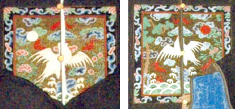
A significant feature of an ancestor portrait, when it was appropriately authorized by the man’s occupation, would be the inclusion of the square rank insignia or mandarin (bureaucratic official) badge on the outer robe, as seen in these two portraits. Respect for rank and social position is important in China’s traditional Confucian society. The Ming dynasty dress code was established in 1368 and supplemented in 1391 to include display of the rank insignia. There were nine ranks each for civil and military officials, with civil ranks represented by different birds and military ranks identified by a real or mythical animal. Birds were selected for civil officials because they connoted literary elegance, whereas carnivorous animals projected the ferocity and courage suitable for military officers. The badges were created in workshops by skilled craftsmen, paid for by the officials themselves, and sewn on the front and back of the outer robe. The bird on the mandarin badge in these portraits appears to be a silver pheasant, distinguished by its white color and serrated- or scalloped-edge tail feathers, which typically numbered three in the early Qing dynasty but later increased to five. This is the emblem for a 5th rank civil official, consistent with the blue mid-rank color of the man’s inner robe.
It was not unusual to portray an ancestor in their portrait with a rank higher than their rightful civil appointment. Though ancestors were commonly elevated to a superior rank based on a descendant’s rank of merit, this deliberate distortion of biographical fact may also reflect the ongoing struggle throughout the Qing dynasty to prevent subordinate officials from appropriating a higher ranked badge for themselves than they had earned in order to gain status. In fact, the Qing court amplified these factual lapses by eventually setting up a system to sell insignia rights as a means to generate revenue, bypassing the civil service examination as a requirement for procuring or advancing a rank. Tables of prices for the ranks were first issued during the Qianlong dynasty, and included purchase fees for a rank with or without the right to hold office for oneself or one’s father. All these came with the right to wear the costume of the rank, including relevant hat ornament and mandarin badge.
In addition to the rank bird or animal, badges from the late Ming period onward typically included symbolic representation of the universe, i.e. land, sea, and sky usually shown in the form of stylized, rocks, waves, and clouds. In the badges of these SDMA ancestor portraits, the sea is shown by the white rimmed waves at the bottom and the sky by the blue and green clouds at top and mid-range, while the land element seems to be represented by the trees and plants rather than rocks. As cultural traditions weakened during the Qing period, the scenery of mandarin badges became cluttered with other symbols of the patron’s (i.e. the official commissioning the badge) choice, e.g. for wealth, longevity, and good fortune. In these two SDMA portraits, the man’s badge includes a pine tree at the left to convey blessings for long life and on the right there appears to be a peach tree, emblematic of immortality (an even more powerful wish for long life), while the woman’s badge appears to have a peony plant at the left whose flowers were thought to bestow riches and honors and also the peach tree on the right. Both badges have red bats flying in the air; in Chinese, the word “bat” is a homonym for the word “blessings”, so bats symbolize good fortune. The bat at the top of each badge is upside-down; the Chinese word for “upside-down” also means “arrived”, so the upside-down bat can symbolize “blessings have arrived”. Furthermore, the characters for “red bat” and those for “vast happiness” are sounded alike, so the red bats in the sky can be interpreted as “vast happiness reaching heaven”.
However, after the rank bird or animal, the most essential symbol on a Qing mandarin badge was the red sun which represented the emperor and was introduced as a requisite design element probably during the Kangxi emperor’s reign (1662-1722). For civil badges, the sun was positioned in the upper left corner (as you look at the badge) with the bird facing the sun because for audiences with the emperor, civil officials would kneel at the emperor's left in front of him, facing at a right angle to him with right shoulder closest to him. Therefore, the sun would be under the right shoulder of the wearer and would be on the side of the badge closest to the emperor, so the bird would face both the sun and the emperor. Note that for military officials who would kneel to the right of the emperor, facing at a right angle with their left shoulder closest to him, the sun location and animal orientation would be reversed, with the sun located in the upper right of the badge (as you look at the badge) and with the animal facing it towards the right so both would be oriented towards the emperor during court audiences.
This standardized location of the sun and orientation of the bird presents an anomaly in the badge for the man’s portrait here, which shows the bird correctly facing the left upper corner but the sun disk is in the right upper corner instead of the left corner. Another example of this irregular location for the sun disk is seen in Acc. No. 1939.94
; other ancestor portraits in the SDMA collection, Acc. Nos. 1936.17
and 2010.224
, show the correct location of the sun and orientation of the bird, as do several independent insignias of rank in the collection, and Acc. Nos. 1951.15.16.1, 1951.15.16.2, and 1983.25. Two ancestor portraits in the Sackler collection (s1997.39 and s1991.130) also have this anomalous location of the sun disk in the upper right corner, but in those portraits the bird’s body is facing left according to convention, however the head is turned to the upper right looking to the sun. For both of those portraits it is known that the sitter received the portrayed rank posthumously based on a descendant’s merit. However, there is insufficient evidence to support a general statement that non-standard placement of the sun and/or orientation of the bird’s head definitively signify a posthumous conferral of the rank.
Lack of conformance in ancestor portraits to sumptuary laws for attire and rank insignia is frequent enough to suggest that either portraiture practice was not committed to accurate verisimilitude and/or the sumptuary regulations were not always followed strictly. In Qing times there was also the occurrence of completely fabricated ancestor portraits to portray a faux lineage of exalted pedigree for arriviste officials and merchants, and in the 20th c. simulated ancestor portraits were produced for the tourist market and for interior decorators. Thus there was sufficient variation and reasons for the variations in both the actual mandarin badges and their portrayal in ancestor portraits to preclude pinpointing the reason and meaning for the anomaly in the sun position of the mandarin badge in the man’s ancestor portrait Acc. No. 1975.78.
It was customary from the Ming dynasty onward for a wife to wear the same rank badge as her husband on her outer robe for official events. However, because a woman was usually seated next to her husband at his right, a woman’s badge was made in reverse, with the sun in the upper right and the bird facing the right so that the birds would be facing one another, as seen for the badges in these two SDMA portraits. The anomalies in the woman’s badge are that the sun disk has been replaced with the moon and, again, the location of this moon is not in the expected conventional location for the celestial orb on a woman’s badge, i.e. the upper right, rather it is located in the upper left and her bird does not face it. A mandarin square in the University of Pennsylvania collection (52-23-111A) with a moon in place of the sun is described as not being an official rank insignia badge, but rather for a bridal or funeral robe. Given that the inclusion of a moon in place of the sun occurs in this badge for a woman’s ancestor portrait, it suggests her outer garment may be intended to connote a funeral robe, and so the moon may be an example of artistic license or patron’s choice to truthfully signify the posthumous bestowal of the rank honor. Noting that the moon is a Chinese symbol of the female principle while the sun often represents the male principle, the badges in these presumptive husband-and-wife ancestor portraits are linked complementarily by the same anomalous placement of their respective solar and lunar orbs, which in turn have each been associated in at least one other example from a museum collection with recognized posthumous badge depictions. Thus taken together, it is plausible the anomalies seen in these portraits signal the feigned but honorary status projected onto these ancestors which they did not in fact enjoy in real life.
All the influences during the history of ancestor portraits and mandarin badges make it difficult to definitively elucidate the factual basis for what is shown and the meaning of the anomalies in these two SDMA portraits, however they do portray the respectful honors desired for beloved ancestors and the hope for blessings to emanate from them.
May 2025 (016)
Meiping Vase, Pinnacle of Porcelain, China, 13th c.
Meiping Vase, Pinnacle of Porcelain, 1403-1424, China
Mandarin badges and anomalies seen in these SDMA portraits, 19th-20th c.,First printed for members in the AAC Newsletter – January 2022
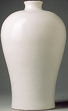
The material, technique, and design of this Meiping Vase exemplify the pinnacle of porcelain production from the Ming dynasty imperial kiln at Jingdezhen in the south of China. Its modest size, 9 3/4 in. x 6 in. x 6 in. (24.77 cm x 15.24 cm x 15.24 cm), belies the rarity and special significance of this type of white porcelain for the third Ming emperor, Yongle (r. 1403-1424). The vertical contours of this vase are defined by a sinuous line that provides strong visual impact with its simplicity and elegance. Yet tension is expressed by the top-heaviness of the strong and full rounded shoulder balanced atop the slender waist and slightly flared base. Careful sculpting of the form gives the work an almost perfect symmetry when viewed in the round from any point of view. Aside from the unblemished milky white body that imbues the vase with a sense of purity to complement the perfection of the form, the luminous clear white glaze reflects light softly, giving the vase an exceptionally smooth but warm surface sheen that accentuates the curves. An almost imperceptible incised design known as anhua is a secret or hidden decoration that requires close inspection of the vessel, to be revealed only with the privilege of such access.
White ceramics were revered in China as early as the Shang dynasty (~1600-1100 BCE) for use in ritual ceremonies at the royal court, and have been fashionable from at least the Tang dynasty (608-907) when they were praised by poets and used for drinking tea. The most refined and elegant white ceramics were made possible by developments in the Song dynasty (960-1279) when identification of the sources and proportions of the best white clays and stone materials for the potter’s raw blend lead to wares known as porcelain. Porcelains are made from a mixture of white kaolin clay and a type of white silicate rock (petuntse or baidunzi) and fired at a high temperature (above 1260 ᐤC) leading to wares with a hard and impermeable, fine grained and translucent body that ring when struck lightly. The later Yuan dynasty (1271-1368) established Jingdezhen as the center of excellence for ceramics production, particularly porcelain, based on its fortuitous location near vast reserves of white kaolin clay in the nearby mountains, white petuntse stone across the adjacent river, and forests for the ample supply of wood needed to fire the kilns.
The Yuan dynasty rulers and nobility were followers of Tibetan Buddhism since the time of Kublai Khan. In Buddhist thought, the color white embodies the transformation of the delusion(s) of ignorance into the wisdom of reality because white actually includes all the colors of the spectrum and is considered pure light. To the Mongols then, white was an auspicious color, and the Yuan elite favored white porcelain wares from Jingdezhen for religious and ritual ceremonies.
In the early Ming dynasty, the Yongle emperor’s adherence to Tibetan Buddhism certainly would have influenced his favoritism for white ceremonial wares, but there was likely also a more personal association with the color white for him. While still a young prince, one of his Buddhist monk advisors predicted that he might one day “put a white hat on his rank”, alluding to a rebus (visual riddle) for the Chinese characters for emperor (huang) which consists of the character for white (bai) over the character for prince (wang), despite his not being the presumptive heir to the title. The Yongle emperor apparently indulged his especially fervid love of white porcelains, since archaeological excavations at the site of the imperial kilns at Jingdezhen from strata dating to this period suggest that more than 90% of the kilns’ output at this time was whiteware. As emperor, Yongle was ambitious and extravagant and used gifts for strategic political purposes and as a show of power, wealth, and good taste; it is noteworthy in this regard that Yongle initiated the practice of stamping his reign mark on the bottom of imperial porcelain wares. Jingdezhen wares from the imperial kilns were commissioned as decorative items for the court or to be given as diplomatic gifts to impress foreign dignitaries, religious emissaries particularly from the Tibetan Buddhist hierarchy, or very important favored subjects of the realm.
Meiping means “plum vase” and is a form that originated in the Song dynasty, possibly inspired by the silhouette of the female figure, a credible hypothesis given the vessel’s beautiful proportions and curvaceousness. However, it also exhibits the simplicity and elegance for which Chinese ceramics are well-known. The original use of such containers was most likely as a wine jar, particularly plum wine, since the form became popular after the tenth century as domestic demand grew for ceramics for dining and display. In time this type of vessel may have been repurposed to hold a single stem of blossoming plum, though its use as a wine jar probably continued into the Yongle period.
This vase was made at the height of white porcelain excellence in the Ming reign of Yongle, and what is unique about the porcelain from this time is the glaze, which reflects light softly making the porcelain surface look like melting snow or the unctuous surface of white jade. A composition for the glaze was developed with increased feldspar content and reduced lime that makes it especially clear and white. It is also very thick, so very small bubbles are trapped in it as it is fired. These are densely distributed and scatter the light that falls on the finished vessel, giving it that special snow-like or jade appearance. Evidence for these bubbles on this vase can be seen with close scrutiny (most clearly on the top side of the shoulder on this vase where the light shines most directly on it) as miniscule pinprick holes in the glaze (scaled-down orange peel effect), left by bubbles on the surface that burst. Whitewares with this glaze became known as “sweet white” (tianbai) porcelain, so named in 1591 by the Ming dynasty writer Huang Yizheng possibly to connect metaphorically the color and admiration of these porcelains with the recent and fashionable introduction of white sugar to the tables of the elite.
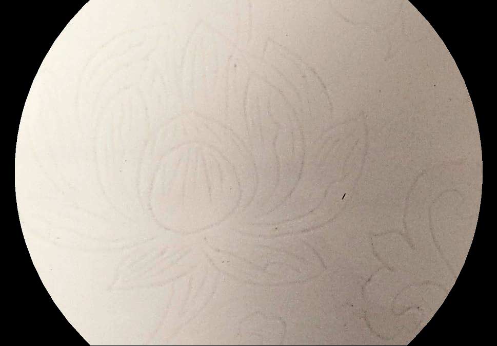
Finely incised designs were applied to the body of this vase before application of the glaze and are known as anhua (“secret or hidden decoration”). Porcelain wares with the exquisitely subtle anhua were reserved for use only by the emperor or his court. On this vase, the anhua designs of peonies and other floral and scrolling vine motifs appear as a tracing in three registers between four sets of incised concentric double bands below the glazed surface; these incised tracings do not alter the glossy smooth finish, appearing as though being viewed through water in which the surface remains undisturbed and placid.
It is notable that though the modeling of the form of this vase is so precise that the work is flawlessly symmetrical from any angle of viewing, yet we can see subtle reminders of the hand of the artist in the ever-so-slight indentations on the surface of the body, more apparent in the lower half as faint mottled shadows, shrouded but not concealed entirely by the clear glaze. So the vase displays two forms of hidden or virtual texture implied by the incised designs and surface modeling of the clay in counterpoint to the manifest smoothness of the clear glaze coating. Given the skill of the artist, these shallow surface features must surely be intended as a textural nuance that can only be detected when viewed at very close range, as another “surprise” feature complementary to the anhua incised patterns, to be recognized and appreciated by only a privileged few beholders.
The flower and vine motifs exemplify the ongoing influence on Chinese art of Daoism, a philosophy which emphasizes living in harmony with nature. In the symbolism of Chinese art, the peony is the flower of riches and honor and, because it also represents feminine beauty, it can be an emblem of love and affection, and represents the season of spring. Furthermore, known as the King of Flowers and associated with the imperial family since the Tang dynasty when it was cultivated in the palace gardens, the peony makes a fitting design for this imperial vase.
Though fundamentally a utilitarian form for use as a container, this vessel also illustrates the sculptural and aesthetic possibilities of porcelain and how it could be used as an emblem of power and influence, wealth and good taste, by the Yongle emperor.